
|
This is my first project for my Multimedia Writing & Composition class (Playing with words | Designing with text). We were asked to design a song (or part of a song) in Microsoft Word using different fonts. 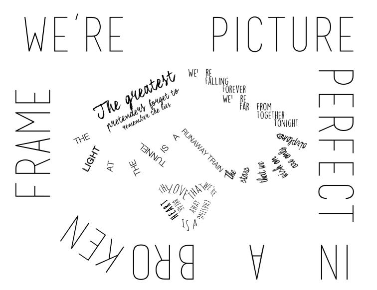
Lexi Loccisano
ENC 3433 Douglas Walls February 7, 2015 Project 1: Visual Rhetoric Song: “Broken Frame” by Alex & Sierra DESIGN CHOICE & EXPLANATION For my design of the text, I played mostly with alignment and proximity. My focus was on creating shapes, and within those shapes, more meaningful shapes and design choices. I created this piece on Microsoft Word and used textboxes for each element except the top line, “we’re picture.” I switched the orientation to landscape and set the margins to .5” to provide a bigger picture horizontally. The outer edge of the piece forms a broken frame and is the last line of the chorus, “we’re picture perfect in a broken frame.” The separated proximity between each word serves as holes and represents where parts were taken out. The word “broken” is broken by syllable - the alignment of the second syllable is rotated and disconnected from the first part of the word. The font size of the broken off piece is also slightly smaller (90) because it makes it less perfect. The font size of the rest of the frame is 100 because 100% is associated with being a “perfect” score, which I think connects to the “picture perfect” part of the lyrics. My font choice for the frame is “Basic Title Font” which is a sans serif font. I chose this font because it is simple, in all capitals, and creates the feel of a rectangle outline for the frame. The title of the song is in this line also, so the font is a good representation of a title. For the first lyric (in order of this song excerpt), “the greatest pretenders forget to remember the lies,” I used “Coalhand Luke” font. I chose this font for a couple of reasons, one – I liked the fanciness of it and thought it fit well, and two – coal is what you get for Christmas when you’re bad, and lying is bad. The font is fancy because lies can be considered fancy or even elaborate. I created a center alignment and decreased the font size in each line. This part of the song is the only part that is center aligned, and that is to draw attention to this line, as it is the first line from this excerpt and an important one. The first line of this part of the song is just “the greatest.” It is the largest in size not only because it is on the first line, but also because people who lie think they are “the greatest” and have big heads about it. The line under that, “pretenders forget to,” is in somewhat close proximity to and similarly aligned with “THE” from another stanza of the song, which puts emphasis on the repetition of “the.” That line leads into the smallest and final part of this stanza, “remember the lies.” I made this the smallest because it is easy to forget lies, and people who lie like to pretend that they are small and don’t matter, like little white lies. The next line in the song is “we’re falling forever, we’re far from together tonight.” I chose “Lemon Yellow Sun” for the font of this stanza. This is another all-caps font, but it is a handwriting font style. I wanted to create a bit of contrast between the happy, bright name and style and the sad, dark lyrics of the song. “We’re” is repeated twice, and the “f” and “t” sounds are repeated through the alliteration in this stanza. I noticed that when I use this font, it creates a lot of space after the apostrophe (maybe it’s a font glitch?) I liked that though because I thought it fit well with the meaning of separation. The whole stanza is stepping down and separating itself in proximity as the relationship is going downhill and the people involved are stepping down away from their problems, and away from the relationship. The next stanza, “the light at the tunnel is a runaway train,” is in one of my favorite sans serif fonts, “Helvetica Neue – Light.” Even though “Medium” probably would’ve been easiest to read, I felt that “Light” fit the line better. I made the word “light” bold to create a contrast and indicate the font style (ironically, bolding it made it not very “light” anymore...more contrast!) The words “the,” “light,” “at,” “the,” and “tunnel” form beams of light and the outer corner of an upside-down heart. “Is” and “a” are separated because “a” is running away from “is” and “runaway train” is separated from the rest of the stanza because it, too, is running away, and going downhill to represent the relationship to which the song is referring. For the next stanza, “the stars that we wish on are only airplanes,” I used the “Witched” font. I chose this font because I liked how the lowercase I has a star. I also thought the name of the font fit well with the lyric, because if you looked up and thought you saw stars but they turned out to be airplanes, you would feel tricked, which makes me think of witchery or being witched. The font slowly curves up and ends up upside down by “airplanes,” which I decided would represent a literal airplane that is upside down and about to crash (representing the relationship). However, the next element, and final stanza represents some hope for the relationship. The line is, “the love that we’re chasing is a heartbreak away.” I chose “Amatic” font for this and created a heart shape out of the stanza. I used a transform warp effect to create the outer edges of the heart. I chose the font Amatic because it is the font Alex & Sierra used in their first lyric video for the first song they released, “Scarecrow,” and I wanted to make a connection to that song because it’s about believing in their love. SONG CHOICE & INTERPRETATION First, a little background on the song; according to Wikipedia Alex & Sierra wrote “Broken Frame” along with a few others – Sam Hollander, Ali Tamposi, and John Ryan. Alex & Sierra wrote most of their songs (along with co-writers) at a writing camp/retreat after winning the X Factor. They shared in a few interviews that they had never written a song together before winning a record deal through the X Factor. I chose this song for a few reasons. First, Alex & Sierra inspire me. They are some of the most talented, humble, and entertaining people I have ever met or seen. They went to UCF, which gives us some commonality. They write very powerful, meaningful, and relatable lyrics, and their harmonies are quite beautiful. As Alexa Rahmanparast, managing editor and writer for Mind Equals Blown, said, "Broken Frame" delves into the hard times of a relationship, and the lyrics are genuine because they are based on real emotions that many people feel at some point during a relationship. I enjoyed watching Alex & Sierra while they were on the X Factor. I started watching from their audition. They performed a sultry cover of Britney Spears’ “Toxic.” I enjoyed watching them perform, improve, win over the crowd, and eventually win the X Factor. Fortunately, I have had the wonderful opportunity of seeing them perform live twice since their X Factor victory (and was able to meet them both times!) I was learning this song on guitar to cover it when I realized it would be perfect for this project. I love the lyrics and I realized how visual they are. I immediately thought of the broken frame as a literal broken frame and thought to put a heart of text in the middle to represent the “picture perfect” part. A lot of my planning process in the design and in interpreting the song involved an “analog” approach (as Austin Kleon would call it). I did some sketching to figure out how I wanted it to look, and to just get my ideas out on paper. Later on, I decided to make two hearts instead of just one. I also decided to make one big upside-down one, and one smaller right-side-up one. I think a lot of the song represents a relationship that is falling apart. Unfortunately, I was not able to find much on the meaning of the song, as it is a fairly new song (on their first album, “It’s About Us,” released October 2014). However, there are two different ways that I thought of interpreting it. First, what you see on the outside, or how couples represent themselves in public isn’t always the truth about how they really are or how they feel. They might look great together (they might be “picture perfect”) but they might not have the best relationship (“broken frame”). The base (the frame) is breaking and the picture perfect, surface part is the only thing holding it together. I also think that the song could be interpreted in a way that the “broken frame” would represent societal images of how relationships should be, and the “picture perfect” couple doesn’t fit into “the broken frame.” It could be a great relationship, but because of limitations or societal views, it might be doomed to fail because of the “broken frame.” The design elements make it a little difficult to read the lyrics because the meaning of the song, and sometimes people and relationships are hard to read. I think the design of the piece matches my interpretation, as well as interpretations that others might have on the song. You can’t judge a book by its cover, and you can’t tell what’s going on in a relationship just by looking at it. Just as you can’t tell what the lyrics say just by looking at them or listening to them – you have to really think about it and internalize the words and images. A friend of mine also pointed out that the “pretenders” and “broken frame” are relevant today in terms of social media – many people pretend, or put a “picture perfect” image of themselves online, but might be broken inside and no one could see or tell. Although most of the song is sad or as Sierra might call “depressing,” I think the song is not entirely sad overall, even in the excerpt used for this piece. As I mentioned in the design explanation section, there are moments of optimism or at least hope for the future. There’s a line later in the song that is repeated a few times, “gotta open our eyes,” that I think is the most hopeful moment in the song. The relationship is in a dark place now, and it is headed down, but there is still hope for the future. Works Cited Rahmanparast, Alexa. “Alex & Sierra: It’s About Us.” Mindequalsblown.com. Mind Equals Blown, 14 October 2014. Web. 6 February 2015. |
|||||